PTC (Public Transport Council) Logo and Corporate Identity Guide
Back to portfolio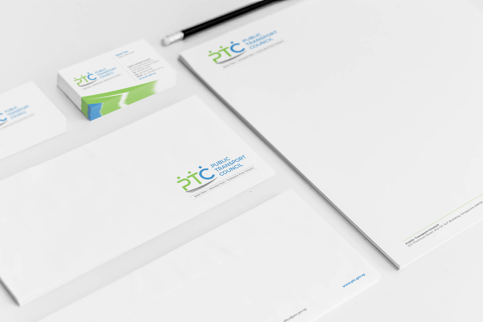
Corporate Identity Design
Project Requirements:
The role of the PTC evolved in 2016 with a body corporate entity to discharge its statutory responsibilities of regulating public transport fares and ticket payment services, as well as undertaking a new role of recommending measures for the Government to improve public transport services. As such, a new corporate identity was required to set clear internal directions and external interface with the various stakeholders.
Solutions for Client:
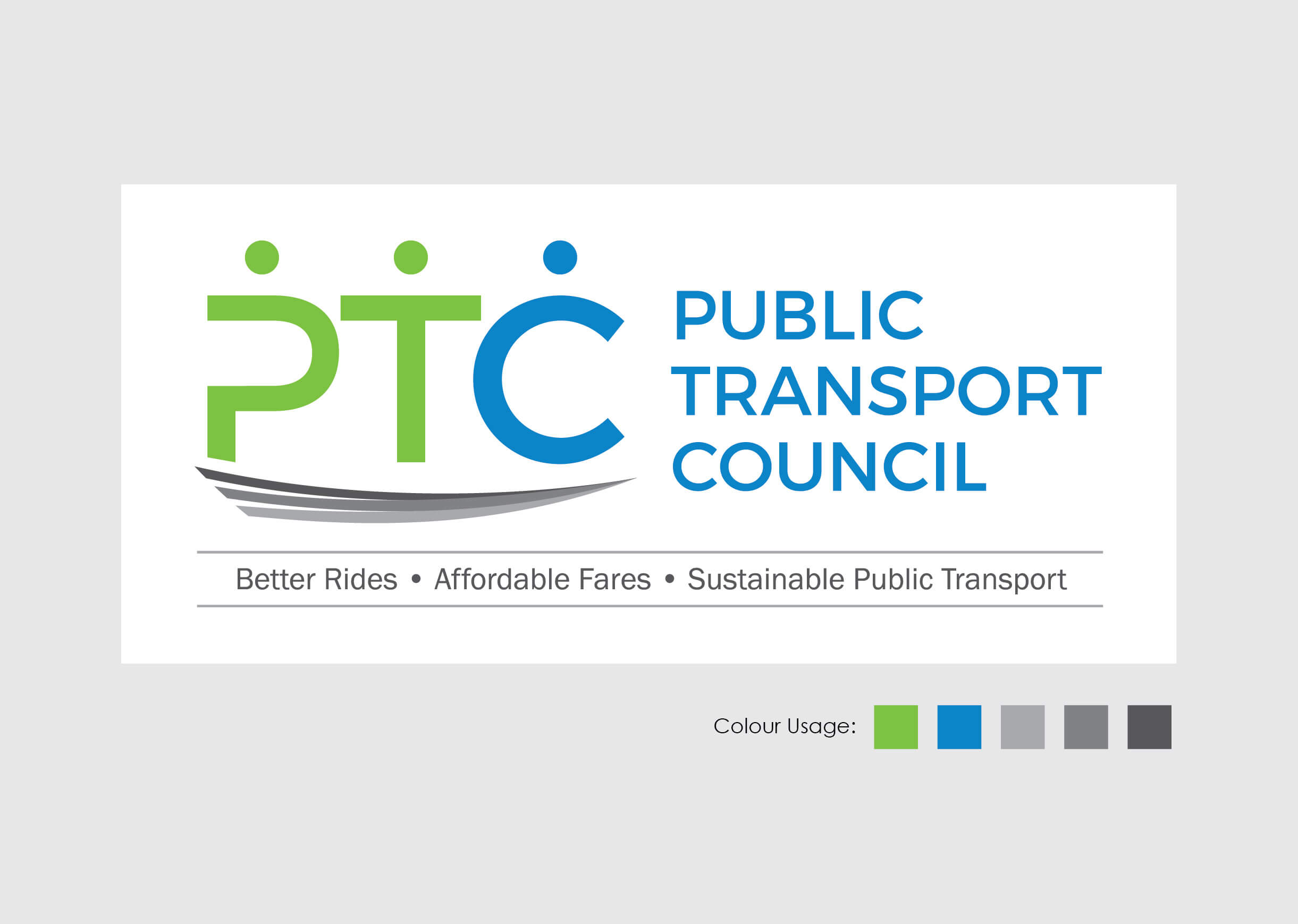
We created a human-centric logo and thoughtfully constructed the human element by adding a circle (or dot) above the abbreviation PTC and signed off with a textured line that has aptly presented the moving mood to symbolise traveling on the road. The three human elements have also meaningfully depicted an objective and fair collaboration between the Council, the operators and the commuters.
Green and blue was used as the colour of the logo to complement the graphical attributes of the icon since the psychological characteristic of green includes balance, forward-looking and effectiveness; and blue has psychology characteristic of integrity, reliability and professionalism.
Project Deliverables:
- Logo design with rationale
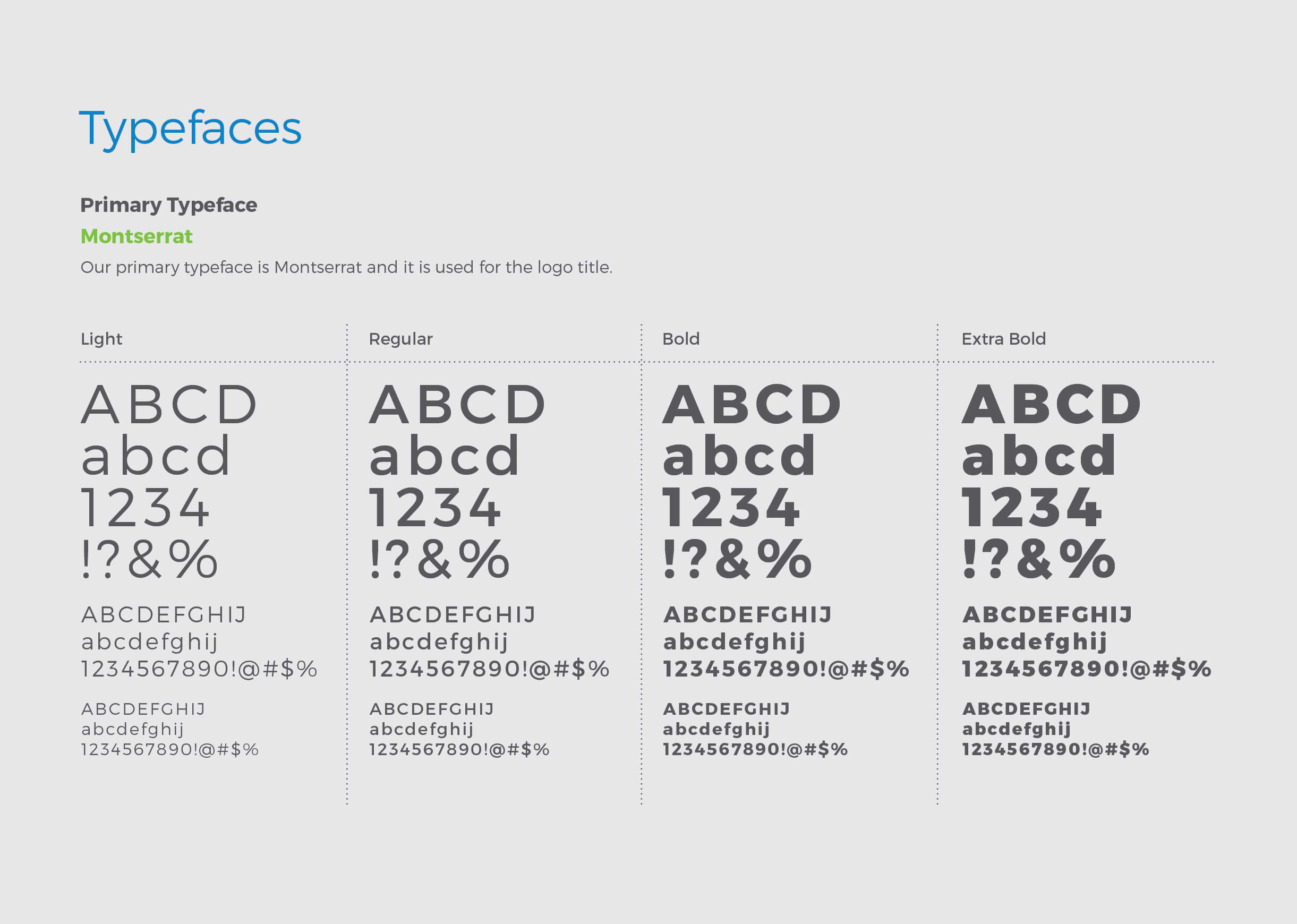
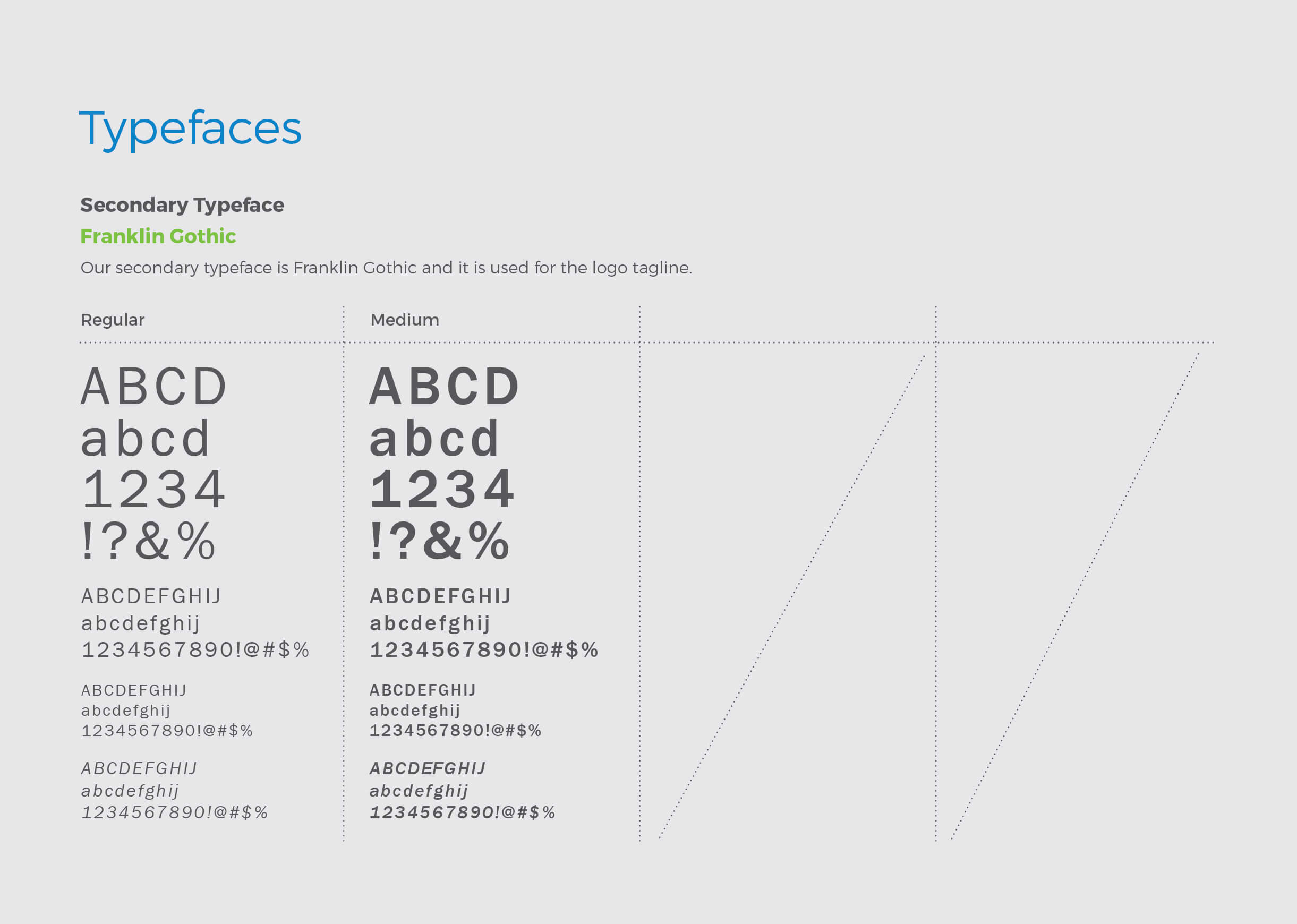
- Corporate Identity Guide
- Vision and Mission Statement drafting

